








Kelly Huether Reacquires Life of Riley and Riley Salon Resources
Life of Riley Salon Supply and Riley Salon Resources are back in the family, as Kelly Huether acquires the professional distributor he co-founded in 2013.
by Staff
 MENU
MENU SEARCH
In this rare essay, the president of a haircare brand takes us behind-the-scenes into a world we never see when we pick up a product off the shelves--the arduous, thought-probing, second-guessing journey of rebranding a legacy product line. Not only is her reflection fascinating, but it is also incredibly useful for any salon owner or manufacturer contemplating their own brand.

SEVEN Haircare Brand President Sheue Pella takes us on the personal journey of rebranding a legacy brand, from squeezability to naming to editing and educating.
Sheue Pella
Nobody hands you a blank page when you rebrand a legacy brand. They hand you twenty years of decisions, some brilliant, some dated, all of them yours to sort through.
That sorting process is the rebrand. It’s harder and slower than starting from scratch, but also more interesting because every decision has a history behind it.
When we decided to relaunch SEVEN Haircare, I thought I understood what we were taking on. Looking back, I underestimated many parts of it. What I thought would mostly be a creative challenge turned out to be equal parts business strategy, supply chain negotiation, and psychology, not just my own, but that of a team, longtime customers, and salon partners who had built parts of their own businesses around the version of the brand they already knew.
One thing became clear almost immediately. When we shared what we were planning with our closest partners and our own team, there wasn’t much convincing to do. People understood this needed to happen.
But internal enthusiasm doesn’t fund a project or protect it from scrutiny.
Six months into the redesign process, a new CEO joined the company. I had the length of one airport car ride to pitch her on a project already in motion and help her see why it was worth the investment. A repackaging of this scale is a significant capital commitment with no guaranteed return, and I was asking her to believe in a vision she hadn’t been part of building.
Then she saw the rendering. Her expression changed almost immediately. By the time we finished talking, I could hear in her voice that she believed in it too.
I’ve thought about that moment many times since. No matter how well you can describe a creative vision, there is no substitute for showing it. If you’re trying to bring a skeptic along on a brand decision, get them in front of a visual as quickly as you can. It will accomplish more than any wordy deck ever will.
What I didn’t anticipate was how many times I would make a decision, question it, defend it, reverse it, and ultimately learn that leading a rebrand has far less to do with certainty than good judgment.
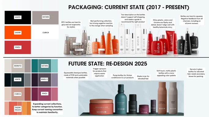
A before-and-after look at SEVEN's package design.
SEVEN
The reason was straightforward, even if the execution wasn’t. SEVEN had spent twenty years earning the trust of salon professionals, and we believed the brand deserved a bigger audience than it had reached. The packaging hadn’t been updated in almost ten years, and while the formulations had evolved, the outside hadn’t kept pace. We had a product we were proud of living inside a container that wasn’t telling the right story.
Growth requires giving people a reason to look twice, and we hadn’t given them one in a while. A rebrand wasn’t a reaction to something going wrong. It was a decision to give ourselves a real chance at what we believed was possible.
Before we talked about color, finish, typography, or any of the things that make a rebrand feel like a rebrand, we talked about squeezability. It wasn’t glamorous, but it was absolutely the right place to start.
We had years of feedback from stylists and consumers, real people using these products in busy salons and in everyday shower routines. Sometimes it was a nozzle that made a mess instead of a precise application, or a pump that dispensed too much, or bottles that were so hard to squeeze that they made you question your hand strength. None of those problems were major by themselves, but together they became the sort of daily annoyance that eventually sends someone looking for another brand.
A full repackaging is a rare opportunity, and you may not get another one for a decade. We decided early on that functionality had to come first. If something wasn’t working for the customer, that deserved our attention before we worried about making it more beautiful.
But knowing the principle and living it are different things.
Early in the process, we had a dream about our hair masks. We wanted a jar. Not a tube. A jar felt more considered and luxurious, more like something you’d actually want on your bathroom shelf. And we weren’t wrong to want it. The brands we admired were doing jars. The aesthetic case was real. A jar in our line, with our color palette and our finishes, would have looked beautiful. I could see it clearly.
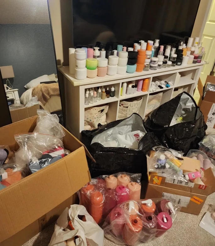
A fun behind-the-scenes image of packaging options lined up at Pella's house. "While I'm not ready to get rid of these yet, I'd love to find a better home for them, so we can have guests over again," she says.
Sheue Pella
So we researched it, and we sourced for it. We spent months finding the right size, the right shape, something that didn’t feel cheap.
Then we read the consumer feedback. It was split, but the anti-jar camp was vocal and specific. Reddit threads full of people who refused to consider jars on principle. Too inconvenient, too messy, and there were more than a few germophobes who had strong feelings about sticking their hands into a shared jar. The only real arguments in favor were that you could get every last drop out, and it looked cute.
We went ahead and ordered samples anyway. When the finished jar arrived, I filled it, put on my consumer hat, and opened it in the shower the way an actual customer would.
It didn’t feel as luxurious as I had hoped. Opening the lid, removing the seal disc, scooping out the product, then replacing everything without getting water inside turned out to be way more cumbersome than simply squeezing a tube. What looked elevated on a mood board felt surprisingly ordinary in the shower.
We went back to the tube. We had said functionality would drive the repackaging, and there was nothing broken to fix about a tube. That’s a distinction that’s easy to lose when you’re deep in the process, when you’re excited about what other brands are doing, and how beautiful something looks in theory. The decision wasn’t about what I wanted to admire on a shelf. It was about what felt right for the people actually using our products.
Once functionality was locked, we could finally talk about what the brand looked like. And the honest answer was that it looked like a different brand than the one we were trying to be.
That’s not a criticism of what came before. The original packaging served us well for nearly a decade, and many customers genuinely loved it. But design ages, and brands evolve.
Modernizing isn’t the same as erasing. We kept the parts that still felt true to SEVEN and updated the rest. We took away the glossiness and added a matte, soft touch finish to the bottles. The colors became quieter and more sophisticated, shades you might actually find in nature, which felt right for a line built around botanical ingredients. For the first time in a long while, the outside felt like it was doing justice to the formulas inside.
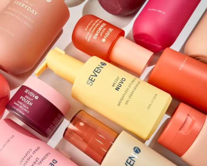
"The colors became quieter and more sophisticated, shades you might actually find in nature, which felt right for a line built around botanical ingredients," says Sheue Pella about selecting the repackaging.
SEVEN
The question we kept coming back to wasn’t what looks luxurious in the abstract. It was what looks like us, specifically, right now, and whether a customer could pick up a bottle and immediately understand what kind of brand they were holding.
Formula changes rarely happen in isolation. They’re usually tied to production runs, because that's when you're ordering new components and updating what's printed on the ingredient list. Before long, the packaging itself becomes part of your formulation strategy.
This was something we had to think carefully about when deciding how to repackage. Brands that print directly on their bottles are effectively locked into whatever formula they're producing until the next major run, while labels and cartons give you much more flexibility. As we weighed different packaging options, we kept asking ourselves how often we expected these formulas to evolve, and whether the packaging we chose would help us move quickly or make future improvements harder.
A rebrand creates one of the few moments when those decisions can all be made together. We had to make decisions for the formulas we had in front of us, but also for the changes we knew we might want to make three years from now.
much and your existing customers can’t find what they’ve been loyal to for years. Change too little and you’ve missed the opportunity to communicate something new to the people you’re trying to reach.
We needed our names to do more work than they had been doing. In professional beauty, a stylist recommending a product to a client needs to be able to explain what it does quickly and confidently. A name that requires translation is a name that slows that conversation down. So clarity became the standard.
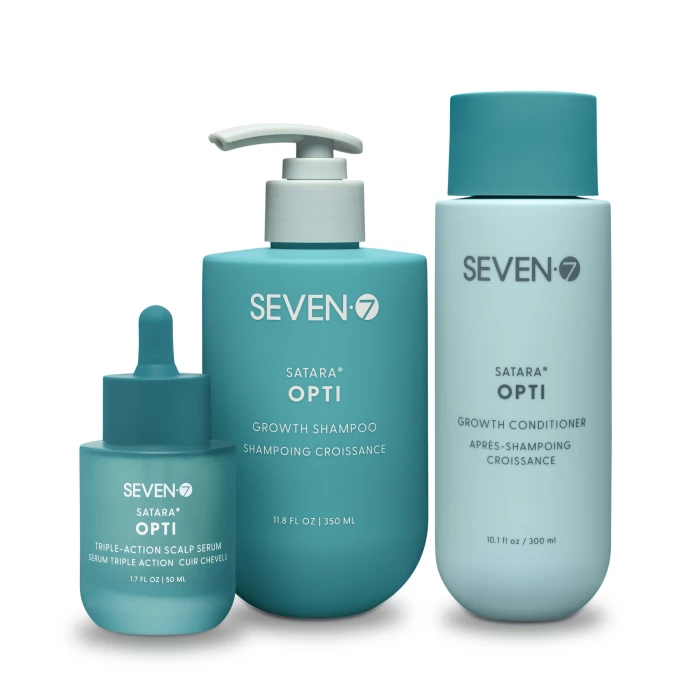
When SEVEN's OPTI line was entered into a prestigious industry contest, Pella learned an important lesson about customer loyalty.
SEVEN
The answer became very clear to me when one of our products was nominated for a prestigious industry award, one decided entirely by public vote. I went to cast my ballot and found exactly what I had feared: a long list of brand and product names, category by category, with no descriptions. Our entry was listed as OPTI Conditioner. To anyone inside the SEVEN world, OPTI means something specific about hair loss and thinning. To everyone else, it means nothing. I remember thinking, Well…there goes our shot. Who votes for a product that tells them nothing about what it does or who it’s for? We knew we had to fix it, and we did, for OPTI and for every other product in our line that might one day find itself on a ballot.
But clarity has a counterweight. We have customers who’ve been asking for certain products by name for years. That kind of embedded loyalty is not something you throw away lightly. A renamed product, however improved, can feel like a discontinuation to someone who has been buying it on autopilot. The trust lives in the name as much as the formula.
We tried to strike a balance. We wanted enough clarity to help someone discovering SEVEN for the first time understand what a product actually did, without making longtime customers feel like the products they'd trusted for years had disappeared. Every name change had to earn its place by making the product genuinely easier to understand, not simply different.
Early in the process we made a decision that felt completely reasonable. We were reimagining the collections, reconsidering everything, and the fabric names, the language that had always defined our product architecture, found themselves on the chopping block. We thought we could start fresh. After all, we hadn’t exactly been leading with the fabric story in our marketing, so maybe it wasn’t landing anyway. Maybe no one would miss it.
So we designed around new names and kept moving forward. Meanwhile, our educators continued doing what they had always done, traveling, teaching, telling the story of this brand in salons all over the country.
We knew stylists responded to the fabric story. We just hadn't understood how much until we were focused on the question of whether to keep it. And it kept revealing itself in those rooms. When the fabric part of the presentation came up, the room would change. Stylists leaned in. The energy shifted. Every time.
That's not focus group data. It's harder to ignore than that. Real people, in real rooms, responding to an idea they hadn't been told to care about.
The idea was simple but distinctive: hair has texture, integrity, and structure, much like fine fabric, and treating it that way changes how you formulate, apply, and think about results. Our collections had always been named after fabrics, GAZAR, KENTE, RINZU, each one chosen to evoke a specific texture and character. It was the most distinctive thing about us. And we had almost walked away from it.
So we went back to the fabric names. Not because we were being precious about the past, but because the evidence was sitting right in front of us. The story was already working. We just hadn’t been telling it loudly enough.
The rebrand became the opportunity to build the brand around what had quietly been its strongest idea all along. That's the thing about a process this long. At some point the data runs out and instinct has to take over. You've heard from everyone, and you've weighed everything. Now you just have to decide.
At some point in every repackaging conversation, someone has to say the quiet part out loud. We can’t bring everything forward.
A full repackaging is not the same as replenishing stock. When you reorder an existing product, you’re paying for what’s inside the bottle. When you repackage, you’re paying for the bottle itself, the tooling, the components, the minimum quantities, the artwork, the setup costs, all of it, before a single unit sells. Multiply that across an entire line and the capital requirement becomes a very clarifying number.
That number forces honesty about your assortment in a way that day-to-day business never quite does. Every SKU has to earn its place not just by existing but by moving. A product that sells steadily, that stylists reorder, that clients ask for by name, justifies the investment. A product that has been on the line for years because no one ever made the decision to retire it does not.
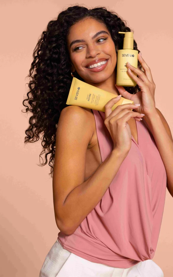
A lifestyle model shot with SEVEN's new rebranding.
SEVEN
We made those decisions. Some of them were easy, products that had quietly stopped pulling their weight and everyone knew it. Some of them were harder, SKUs with small but passionate followings, products that meant something to someone even if the numbers didn’t support carrying them forward.
But editing isn’t only about what you cut. It’s also a chance to look at products that truly matter, that are deeply relevant to your customer, and ask whether they’re living up to their potential. Maybe it needs a refreshed formula or more functional packaging. Sometimes a product that deserved more than it was given the first time around earns a second chance to be what it should have always been.
Discontinuing a product is never just a financial decision. There's always a customer on the other side of it, someone who feels genuine disappointment that a staple is going away and now faces the burden of finding its replacement. That's real, and it deserves to be taken seriously. But a repackaging that tries to bring everything forward is a repackaging that can’t fund itself properly, and that serves no one in the end.
Repackaging doesn’t happen overnight. And while the new packaging is being developed, tooled, produced, and shipped, the existing line still has to function as a business. Products need to be on shelves, salons need to reorder, and customers need to find what they came back for.
Which means at some point you have to make a decision about your existing inventory that has no clean answer.
Old packaging has minimums too. When a product runs low, you either reorder at quantities that make financial sense, stop selling it entirely until the new packaging arrives, or find a third option that wasn’t in your original plan.
I faced this dilemma with a few of our products, but SEAL Spray stands out because it wasn’t immediately clear what we should do. The product was too important to our salon partners to simply disappear from the line for six months or more.
But I couldn’t rationalize ordering twenty thousand units of packaging we were about to retire when we only needed a few thousand to bridge the gap. The math didn’t work, and the waste didn’t sit right.
So we went to a temporary solution. A stock bottle with a label. Not our custom component and not our finished aesthetic, but a practical stopgap that we knew would look like a one-off to anyone paying close attention. The risk felt real. A prestige brand that suddenly has a product in generic packaging raises questions. It can read as an inconsistency, or worse, as a sign that something is wrong.
In the end, it didn’t matter. The product stayed on shelves, and our salon partners kept selling it. For those who noticed the change and wondered what it meant, it turned out to be the first quiet signal that something bigger was coming. An accidental teaser, and in retrospect, not a bad one.
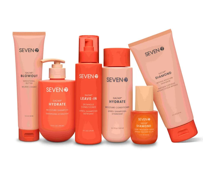
A lineup of SEVEN's Gazar products.
SEVEN
There is a version of packaging sourcing that exists only in mood boards and inspiration decks. Perfect components that are endlessly customizable, available in any quantity, delivered on time, and from a single reliable vendor. That version does not exist in real life.
The dream when we started was to move away from fully custom packaging. Custom means tooling costs, longer lead times, minimum order quantities that require a level of conviction about your own velocity that can be uncomfortable to commit to. Standard components are easier because you can order smaller quantities and they are more readily available from multiple suppliers. If something isn't working, you haven't sunk a significant investment into proprietary molds that belong to no one else.
But standard components have their own limitations. They exist in fixed sizes, shapes, and finishes. And when you have a specific vision for what the brand needs to look like and feel like, standard components will get you close but rarely all the way there. At some point the aesthetic requirement and the sourcing reality meet each other and one of them has to give.
When my sample bottles and caps arrived from dozens of vendors, I started mixing and matching components, assuming that if a bottle neck and cap shared the same dimensions they would be compatible. They are not. A 24/410 bottle neck does not automatically fit a 24/410 cap. I wanted a specific bottle paired with a cap made for a different bottle entirely. The threading didn’t match perfectly, and anything less than a perfect fit risks leakage. Our vendor tried to persuade me, more than once, to simply use the cap that was made for the bottle. It was the practical choice. It would have saved time and cost on everyone’s part. But by that point we knew what we wanted, and what we wanted wasn’t the practical choice. We ended up creating a custom mold just to modify the bottle neck so it would work with the cap we had chosen. What I’d assumed would be one of the simplest decisions in the project became one of the most time-consuming.
Then there are the quantities themselves. Every order is a statement of belief about how fast you're going to grow. Order too conservatively and you risk running out too quickly, then scrambling to reorder before you're ready. Order to your safety and comfort level and you risk tying up all your working cash in inventory if you're not selling fast enough. There is no objectively correct answer. Eventually you settle on the number you can defend to your CFO and live with if you're wrong.
What the customer sees on the shelf is a finished object that looks inevitable. What got it there was a series of compromises, each one made carefully, none of them visible. That invisibility is the point. But it’s worth knowing the compromises are there.
Everything up to this point, the functionality fixes, the aesthetic decisions, the naming, the collections, the SKU edits, all of it happens internally. It’s your team, your vendors, your decisions. The moment you have to communicate the plan to your existing salon customers is the moment the rebrand becomes real in a way that nothing else quite does.
Salons are small businesses. The people who carry your brand have made real decisions based on their relationship with you. They’ve recommended your products to clients, built retail displays around your packaging, trained their staff on your collections. A rebrand that arrives without warning, or without enough context, doesn’t just feel like a surprise. It can feel like a disruption to their business. And in professional beauty, where trust is the actual currency, that disruption has consequences.
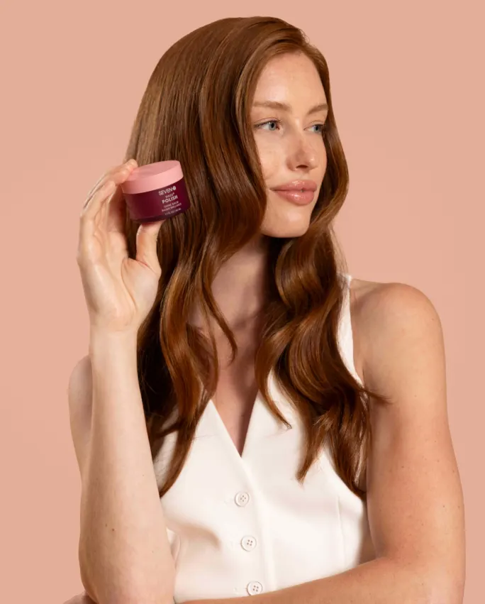
A model with SEVEN's Rinzu Polish Shine Balm.
SEVEN
We started telling our salon partners five months before the relaunch. We didn’t have finished packaging yet. We had samples, and candid photos of those samples, arranged as best we could and pulled together into a few slides. It wasn’t polished, but it was what we had.
The reactions were a welcome surprise. There was genuine excitement, the kind that makes you want to keep showing more people because it reminds you the work has been worth it. We tied account credits to their existing packaging orders so they could apply them toward the new line at launch. We offered full refresh packages with payment plans. We had time, five months of it, to talk through business concerns, answer questions, and make sure no one felt caught off guard.
Everyone who saw it understood they were getting a preview before any public announcement. We treated them as true partners in the process, not as recipients of a decision that had already been made without them. That distinction matters more than most brands realize.
Nobody warns you about what two years of high-stakes decision making does to your personality. Or maybe it doesn't change your personality so much as it amplifies it. Every neurosis you've ever had quietly reports for duty.
I caught myself getting defensive when I had a strong instinct, which is almost the opposite of good leadership. The trained ability to stay open, to ask questions, to hold space for other perspectives, gets harder to access when you've been living inside something for so long that your gut has opinions about everything.
I circled my team around the same topics more times than I'd like to admit. Not because the answer wasn't there, but because I wasn't quite ready to commit to it. I was scared of being wrong, and all they wanted, all any team ever wants, was for someone to just make the call. I know that. And I still made them wait sometimes.
What kept me from going completely off the rails was the people doing this alongside me. People who cared as much as I did, who pushed back when I needed it, who stayed in the room for the difficult conversations, and who somehow remained patient when I brought up the same decision for the fourth time.
You know who you are. Thank you.
None of this happened quickly. From concept to finished packaging took about two years worth of decision making, each one built on the last, often without full certainty about what came next.
Looking back, that timeline feels necessary. We had to get the jar all the way to a finished sample to know it was wrong. Had we been moving faster, we might never have slowed down enough to hear what stylists were telling us about the fabric story. Some answers only reveal themselves when you stay with the questions long enough.
When the packaging finally arrived, we moved straight into the marketing work: the photo shoot, the campaigns, the launch strategy. What most people think of as the fun part of a rebrand. But for me, the work that got us there was where I found the most satisfaction.
The bottle on the shelf hides thousands of decisions. The customer never sees the prototypes that didn't make it, the sourcing compromises, the names that almost changed, the stories we almost abandoned. What surprised me most wasn't how much we changed, but how much we chose to protect. The longer we worked, the more I realized that building the future of a legacy brand isn't about leaving its past behind but recognizing what made it worth preserving in the first place.
Looking at the finished bottles today, they feel unmistakably like SEVEN.
Life of Riley Salon Supply and Riley Salon Resources are back in the family, as Kelly Huether acquires the professional distributor he co-founded in 2013.
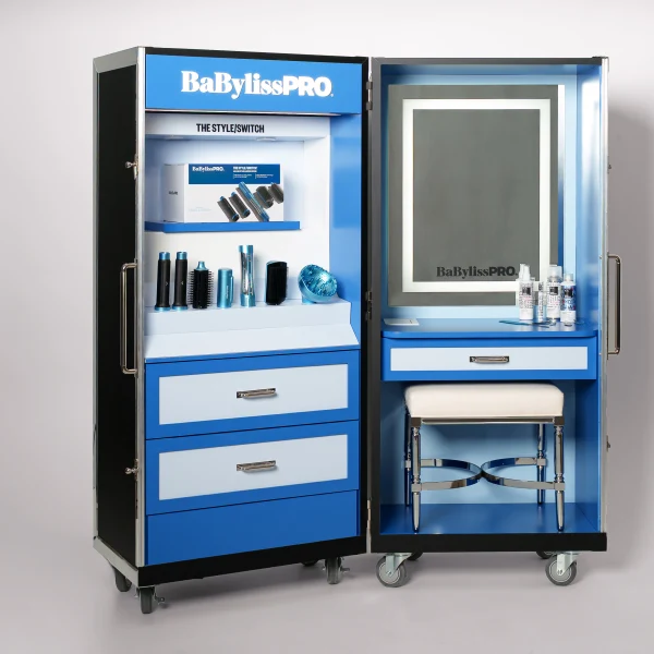
BaBylissPRO and IGK have partnered to launch the BaBylissPRO Studio Trunk, transforming the professional tool brand’s digital Style Studio into a physical experience for the first time in its sixty-year history.
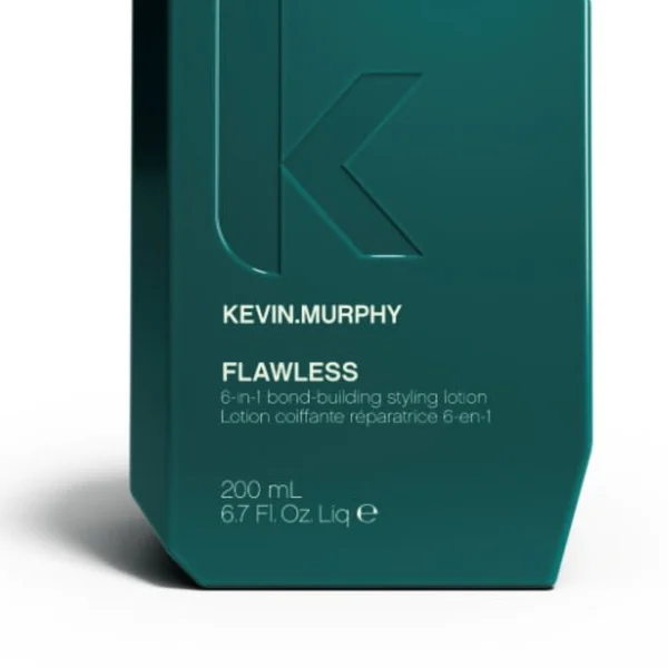
KEVIN.MURPHY's Flawless combines hair repair and styling benefits using KM.Re.Bond technology.
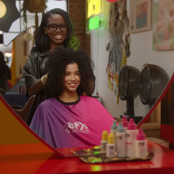
K18 Biomimetic Hairscience has partnered with Beauty Changes Lives to launch the K18 Future of Hair Scholarship, aiming to support aspiring professional stylists by reducing financial barriers to cosmetology education.
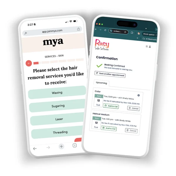
Rosy Salon Software integrates with Mya, empowering salons, spas, and barbershops to transform their websites into powerful, automated lead-generation machines.

Known for his buttery blondes and a technique for highlighting hair with more precision that he called chunking, Brad Johns died on August 27. His friend and fellow colorist, David Stanko, shares thoughts on his talented colleague and close friend.
The Green Beauty Community Foundation convenes beauty brands, salon-industry leaders, educators, and sustainability organizations for a collaborative professional beauty gathering on September 23rd in New York.

At 80, global feminist, former marriage and family therapist, executive coach, and powerlifter Barrie Zucal shows women how to stop letting “debilitating goodness” derail their dreams. Her empowering new book, BOLD: How Women Play BIG by Leading Instead of Pleasing, calls out the quiet conditioning that holds women back from achieving their ambitions — and shows them how to free themselves.
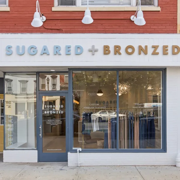
From a Santa Monica apartment startup to the nation's largest sugaring and sunless tanning brand, SUGARED + BRONZED reaches a major milestone with 50 locations across 10 markets.
The Davines Edit reflects the brand’s passion for people and planet.
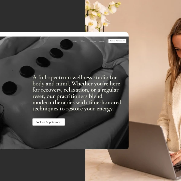
The new service, which builds and maintains websites for fitness and wellness businesses, is the second in Playlist's suite of AI-powered apps, which includes AIConcierge, designed to improve client engagement and booking conversions.

Accomplished business leaders will bring complementary perspectives on leadership, transformation, and the future of service-driven industries.
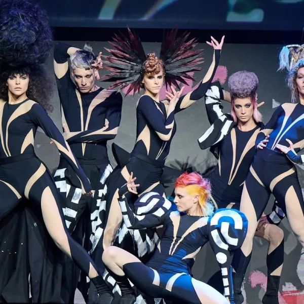
The most iconic show in international hairdressing will celebrate its 43rd edition on November 14th at LOOK Madrid, IFEMA MADRID, in a historic night that will bring together some of its legendary teams and will also host the final of the International Visionary Award across its three categories: Cut & Colour, Men’s and Avant-Garde. LOOK Madrid celebrates its next edition from November 13-15th at IFREMA MADRID.

Axel and Marc Weiss are now leading Artègo USA's distribution operations, introducing a strategy focusing on strengthening relationships with salons, distributors, educators, and sales professionals.

AI, relentless change, employee burnout, economic insecurity. Individually, each presents a challenge, but together, they create what global leadership strategies Thom Dennis calls "the perfect storm." His new book, Rewilding the Corporate Mind, offers business leaders a radically different approach to leading people through today's uncertainty and division.
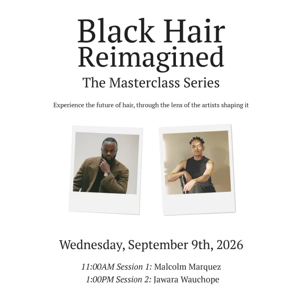
Timed to kick off New York Fashion Week, the intimate, artist-led event focuses on technique, storytelling, and the creative process.
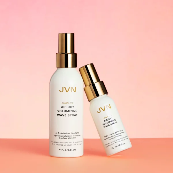
JVN Hair's Summer Protection Duo is clinically proven to provide UV protection and deliver conditioning and texture to keep hair looking great all season long.